It used to be that everybody was into information architecture. We used to quote the gospel of Nathan Shedroff, the teachings of Jakob Nielsen and the books of Steve Krug. However, I have news for you: new web developers aren’t buying the IA gospel.
Websites that mimic applications, one page responsive sites and super-simple apps have rendered the IA practice a second rate passenger in the tours of web development. This is such a shame. New developers are making simple sites that only do one task very well. Let me rephrase that: the portal is dead. Apps are in, one-page sites are in and you don’t need IA for that, right? Wrong. Absolutely wrong.
Information architecture is the backbone of experience design, and as Google is increasingly showing, the backbone of on-page SEO. New developers will learn the hard way that tiny apps and websites have very small leverage with SEs and partners. A small web presence is convenient but lacks a vision of traffic acquisition independence. Such products and services lie at the mercy of Google Play, the App Store and mainstream search engines. By choosing extreme simplicity over depth and organization, such web properties become widgets instead or destinations and die as passing fads once the honeymoon expires. Beware. But what is Information Architecture anyway?
Information architecture (IA) is the structural design of shared information environments; the art and science of organizing and labelling websites, intranets, online communities and software to support usability and findability; and an emerging community of practice focused on bringing principles of design and architecture to the digital landscape. Typically, it involves a model or concept of information which is used and applied to activities that require explicit details of complex information systems. These activities include library systems and database development. (Source: Wikipedia)
The process of bringing coherence and organization to any website is what makes it enjoyable to users and findable by computers. Nowadays it’s a black art that’s sadly dying quickly. Let me illustrate this with an example of bad IA:
TaskRabbit
Most of us are familiar with this service. They provide on demand helpers that run errands or perform basic services for you. Their homepage commits a big omission. They place the navigation links at the bottom of the page:
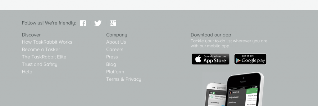
Once we enter the press, about us or Discover sections we see these links at the top and only have the option of navigating with a simple header or go back down to keep browsing the section. This is a clear example of bad IA.

A better design should include a dynamic header displaying relevant links according to the section we are navigating. This is done by creating “personas” or expected use cases of the website. Then you based your organizational and linking structure for these multiple personas. Not for just one use case. The web is literally filled with these omissions and mistakes that are a result of the “app-driven” design ethos that is permeating to the web.
Before undertaking your next web development project I suggest you revisit some of the major teachings of Information Architecture and its founder Richard Saul Wurman. Here are some great resources:
Research and IA for Hispanic Websites (research compiled by my firm IP)
Social Media User Experience (Free Report) Jakob Nielsen
Nielsen Norman Group Reports NN Group
Experience Design Nathan Shedroff
Gotomedia Case Studies Kelly Goto
Information Architecture at Duluth Minnesota University